The problem with margins
We have all been in that situation, you create a component and decide to add a certain margin because the design requires it, later the requirements change and the same component must also be used in another context where the margin must be different, what do you do? Certainly there are multiple ways to solve this problem but most of the time we resort to add props to be able to adapt the margin as required and in the end we end up with a chaos of props and styles that become more difficult to manage, especially in complex projects.
The biggest problem with margins is that they are codependent, that is, they depend on the context in which you want to use them, generally you must take into account the layout of the design and the components that must be separated by such margins, this goes a little against the principles of using components where they should encapsulate their implementation as much as possible regardless of where they are used and with what other components should interact.
In apps that must also work on tablets the problem is more evident since many times the margin that in cell phones should be vertical must be inverted and work horizontally to take advantage of the device width, in this case the props that were already difficult to maintain are now even more so.
Spacer component to the rescue
A Spacer component is a type of component whose sole purpose is to create a space between two elements based on the parameters that we provide, the space can be defined in different types of values, either a number or a percentage for example. Likewise, the space created by this component can work both vertically and horizontally.
In practice a basic (often sufficient) implementation of a Spacer component will accept two props:
Size
Defines the size of the space to be created, this could be defined by a number value or a percentage or some other type of value if required. This prop is mandatory.
Horizontal
Defines whether the space created should be horizontal, by default the space will be vertical.
Thanks to prop-types we can restrict the values that can be passed for both props. For example we can define that the size prop only accepts numbers or strings (to support percentages), likewise, we can define that the horizontal prop only accepts true or false to set the desired direction.
Below you can see the complete definition of this component, it really is a simple but very effective implementation:
import React from 'react';
import {View} from 'react-native';
import PropTypes from 'prop-types';

const Spacer = ({horizontal, size}) => {
  const defaultValue = 'auto';

  return (
    <View
      style={{
        width: horizontal ? size : defaultValue,
        height: !horizontal ? size : defaultValue,
      }}
    />
  );
};

Spacer.propTypes = {
  size: PropTypes.oneOfType([
    PropTypes.number,
    PropTypes.string
  ]).isRequired,
  horizontal: PropTypes.bool,
};

Spacer.defaultProps = {
  horizontal: false,
};

export default Spacer;
Its use is very simple, below you can see some examples of how to generate spaces using this component:
// Renders a vertical space of 40 points height
<Spacer size={40} />

// Renders a horizontal space of 20 points width
<Spacer size={20} horizontal />

// Renders a vertical space of 100 points height
<Spacer size={100} />

// Renders a horizontal space of 50% width
<Spacer size="50%" horizontal />
To give you a better idea of how you could use this component in an app you can take a look at the following image where you can see highlighted in red the position and size of the different instances of the component that could be used to define the spaces between other components:
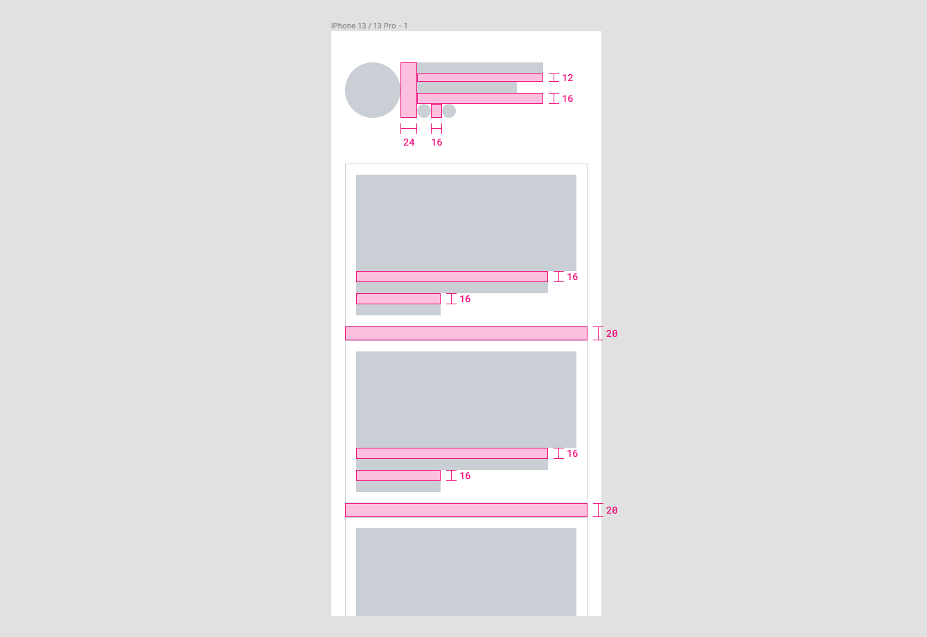
Something very important to keep in mind is that a Spacer component is not a replacement for paddings, if you look at the image above in more detail you will notice that I do not use this component to create the space that exists between the frame of the device and the content of the view, neither do I use it to create the space that exists between the border of the cards and its content, in those cases the padding is the best option.
Advantages of this approach
- Goodbye to conflicts with margins.
- No need to add more props in your components to adapt the margins.
- The styles of your components become more independent.
- You can use the same component to separate components safely no matter what context or layout you are presented with.
- You can adapt the direction and size of spaces dynamically based on factors such as device size or orientation.
This approach could also work in web applications although generally in such projects the space between elements is often defined by other factors besides the margin. Personally I can say that I have used this approach in some of my apps and it has worked great, it is all a matter of stopping a little and thinking when it is convenient to use it and not to exaggerate with its use, as I mentioned before, sometimes the padding is the best option and other times the margin could also be so.
My intention is not to say that you should not use margins at all but to consider other options like this one that may be more effective in many cases, ultimately it's all about creating code that is more scalable and easy to maintain in order to deliver better quality products.