
Why this exploration?
The real estate area is very important in certain moments of a person's life, I mean, basically the companies in this sector are responsible for helping people to choose the home where they will live maybe for the rest of their lives, it seems to me that there are few types of companies that can have so much influence on the future of a person. For this reason I decided to explore with the design of a platform where people can rent or buy properties since I think that most of them are not very intuitive, are saturated with options and do not offer a good user experience, something that I consider decisive when choosing where you want to live.
The concept
The goal of this design is to give the user a sense of confidence and security when choosing a property, knowing that the platform will help the user to make the best decision. To achieve this goal I use soft colors that provide a sense of calm, a good combination of fonts that allow the user to easily digest the information they need, I also try to distribute the elements of the different pages in such a way that the user always has at hand the options they need at that moment.
Home page
The home page allows the user to search for properties quickly, by selecting the type of property and entering the location of their choice. From this page the user can also consult a virtual assistant for additional help if required.
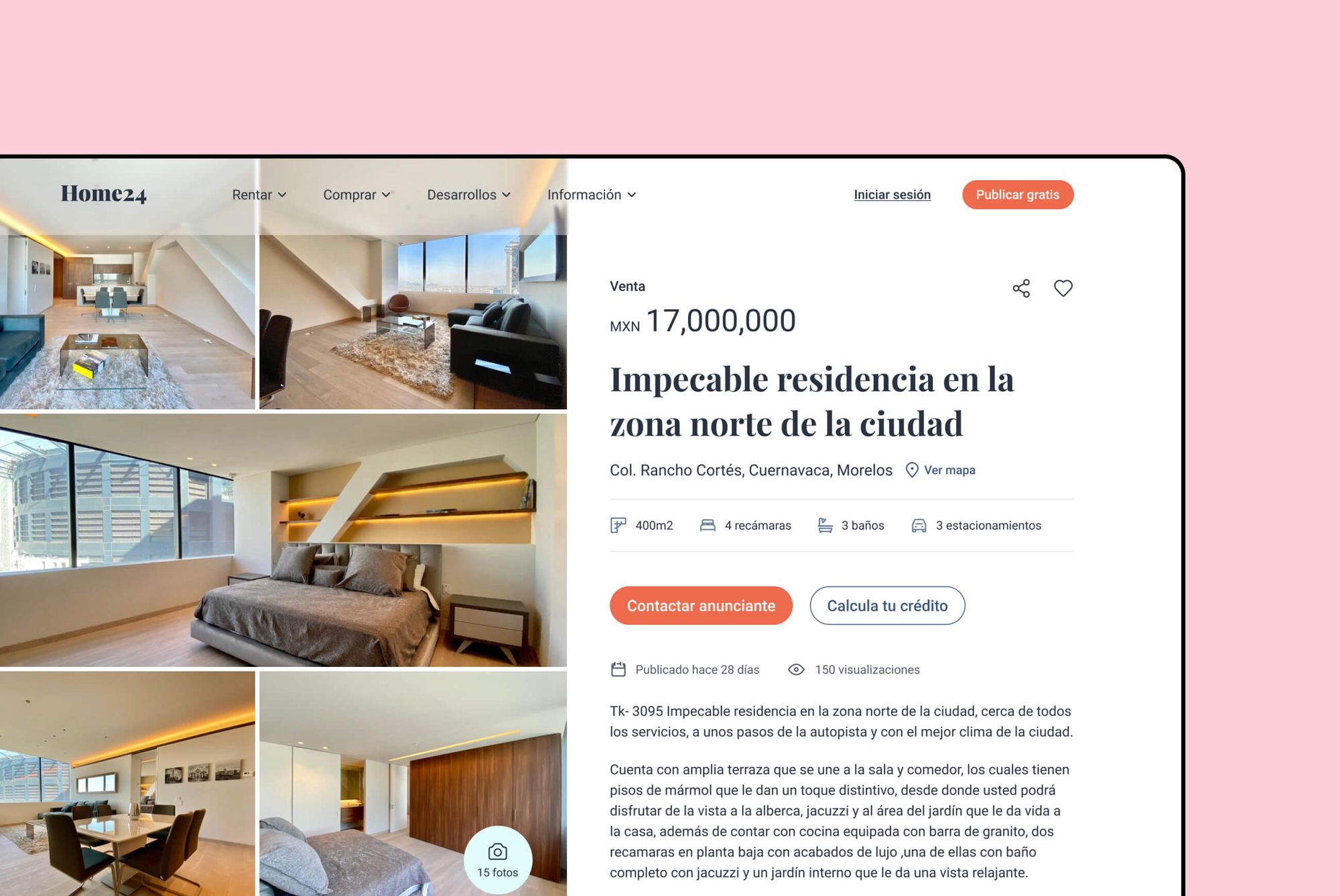
Detail page
On the detail page the first thing that stands out is the photo gallery that will allow the user to decide even before reading the information whether it looks like a good option or not. At a glance the user can see important details of the property such as the size of the lot, the number of bedrooms, number of bathrooms and parking spaces, as well as the address and of course the price. From this page the user can contact the advertiser directly or even calculate his credit.
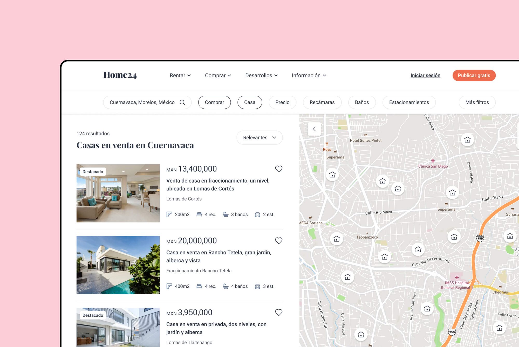
Results page
For the results page I took inspiration from Airbnb's page since it seems to me that they implement certain patterns and functionalities that are very useful for this kind of platforms. Here the user can make their search more specific without feeling overwhelmed by endless options and filters, plus the map could also help them better locate the area where they would like to live.
Final thoughts
I find it unbelievable that in the year 2021 many platforms of this kind have outdated designs and provide a bad user experience, especially in these times when it has been proven that a good design can make the difference between choosing to use a product or another, personally I would prefer to use a product that gives me a sense of confidence from the first moment, especially if I were looking to rent or buy a property.
Thank you very much for reading this far, if you want to share your opinion with me or just say hello please feel free to drop me a mail, I'll be happy to hear from you 😄.