It's been about 9 years since I graduated from the Polytechnic University of the State of Morelos (located in Mexico) and since then their website is practically the same. The problem is not that the site is the same but rather that the design does not reflect the quality of the institution.
It is true that the university may not have a team dedicated to the maintenance of its website (probably students or recent graduates working on it) and that there may not be someone who can take care of the design of it but I firmly believe that a total redesign is necessary if they intend to be the first choice at a university level in the state.
Problems With The Current Design
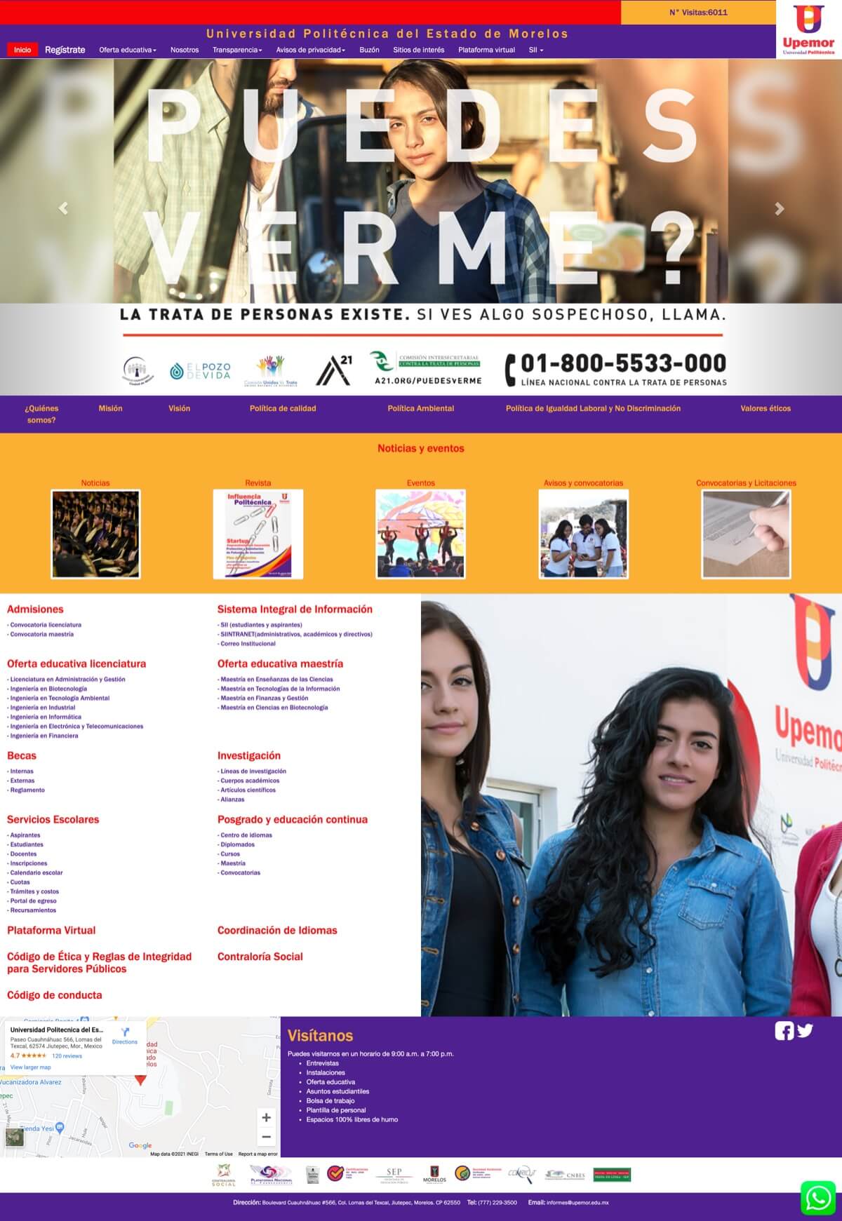
Below I show a screenshot of the current home page so you don't have to open it in the browser as it is quite slow.

The following are some of the main problems that I personally find in the current design and that should be addressed in some way:
- The home page is perhaps the most important of all and yet it does not invite students to make the decision to be part of the university, quite the contrary, and it is not easy to find relevant material because there is no information architecture.
- The distribution of all the sections and elements in general is not optimal, there are very cluttered parts and others too empty, it is very difficult to understand what is important and what is not so important.
- The color contrast of many text elements is not optimal and many students may have problems trying to read. In addition, there is no color balance, all text elements use accent colors.
- The navigation menu is not intuitive and contains links that really shouldn't be there.
- The big carousel at the top contains too many slides (no one is going to see each one) and each slide has a "design" that has nothing to do with the others, not to mention that most of the time the navigation becomes invisible.
- The number of visits is not necessary at all (we are no longer in the 2000s).
- The blocks that form the rest of the page are practically links that are repeated more than once and do not contribute any information.
- The large image at the bottom seems to be there for no particular reason.
- The map can be easily removed as it does not add value and only increases the loading time.
- The Whatsapp button from my particular point of view makes one think that the institution is not particularly serious or professional.
My Redesign Proposal
A few days ago I decided to do something about it so I started to work and made a proposal for the redesign of the home page which you can see below.
Before making a design as such I first organised the available information based on a hierarchical basis and then made low-fidelity prototypes. Then I carefully chose the typography and colors that best matched the image of the university I was trying to reflect.
The goal of my proposal is to show only the information that can be useful and relevant to students in a clear and simple way by making use of well-defined sections, enough empty space to let the content breathe, a well-defined color palette and attractive images.
Here is the proposal I designed:

What's Next?
I plan to contact people who are currently working at the university to show them my proposal and if they like it, see the possibility of working out a plan to implement the design not only on the home page but across the entire site.
I know that there is little chance of this becoming a reality, especially because of the technical or economic difficulties that may exist, but nothing is lost by trying, at least for my part I am more than prepared to work on a project like this.
Thank you for your attention!
